Legacy wineries that maintain visually dated branding — sepia labels, historical-figure imagery, ornate traditional typography — suffer measurable revenue consequences as younger buyer cohorts self-select away from brands that signal “not for me” at the shelf or online. The $94,000 figure represents estimated annual revenue loss from DTC conversion rates suppressed by visual branding that reads as heritage to existing members but as exclusionary or inaccessible to prospective younger buyers. Visual nostalgia is not the same as heritage positioning: heritage conveys timeless quality, whereas visual nostalgia suggests a brand has not evolved. The cost is concentrated in new member acquisition and DTC e-commerce conversion, where visual first impressions determine whether a prospect investigates further.
Hello there, the WISEr.
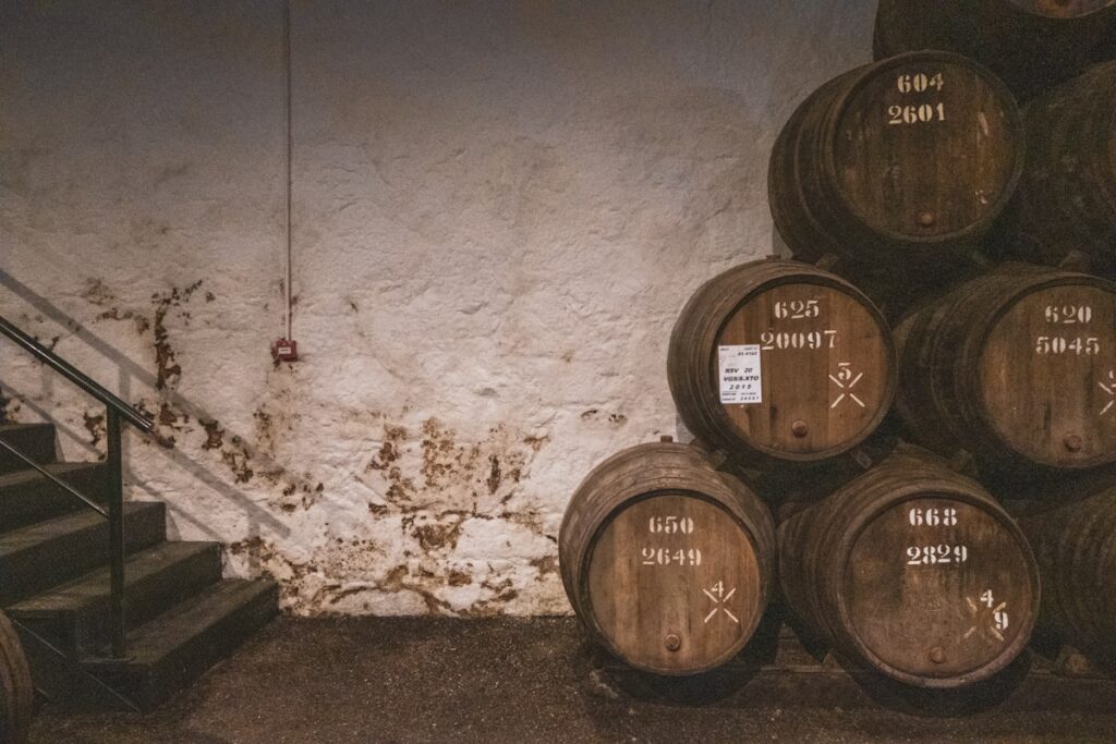
Your label won a gold medal at the state fair in 1992. The design hasn’t changed since.
That consistency feels like brand strength. It’s not. It’s visual stagnation disguised as tradition.
Here’s the problem: for many shoppers, the label is a primary factor in the purchase decision in the first moments at the shelf. Consumers scanning a wall of bottles make split-second decisions based on visual cues: typography, color balance, and layout modernity. Your label communicates “established.” But in a competitive retail environment, “established” reads as “outdated” to younger buyers—an audience you must work deliberately to win.
The numbers tell the story. Legacy Innovator wineries that strategically evolve visual identity while preserving heritage markers may see meaningful improvement in new customer acquisition without measurable loss in existing subscriber retention. Low attrition among current subscribers alongside real new acquisition gains. That’s not a tradeoff: that’s a correction.
The gap between what your wine deserves and what your label communicates costs you real revenue annually in lost recognition among younger demographics who would purchase if they noticed you.
The Heritage Visual Evolution Framework
This framework isn’t about abandoning your identity. It’s about distinguishing between what makes your brand recognizable and what simply hasn’t been updated. Most wineries conflate the two. They assume the entire label is sacred. In reality, one element carries most of the recognition. Everything else is just the frame.
Pillar 1: Preserve the Anchor
Every heritage brand has a single visual element that accounts for most of its recognition: the family crest, a vineyard sketch, a founder’s signature, or a distinctive bottle shape.
Identify yours. This is the element consumers picture when they think of your wine. It’s what they describe to a friend: “the one with the oak tree” or “the one with the old signature.”
That anchor stays. Period.
Now look at everything around it: the typeface, the color palette, the layout grid, the paper stock, the foil treatment. These are the frame. They’ve been the same since the original design because nobody questioned them, not because they’re essential to your identity.
Document what your anchor element is and why it matters. Then list every other visual element and ask: “Does this serve recognition, or does it serve habit?”
Pillar 2: Modernize the Frame
With your anchor identified and protected, update every supporting element to current design standards.
Typography matters most. A 1987 serif font paired with your heritage crest says “we stopped paying attention.” A contemporary typeface paired with that same crest says, “We’ve been here for decades, and we’re still relevant.”
Specific updates to consider:
- Typography: Move to clean, contemporary fonts that complement (not compete with) heritage imagery
- Color palette: Shift from muted earth tones to richer, more saturated versions of the same color family
- Layout: Increase white space; modern design favors breathing room over information density
- Paper/finish: Consider matte or soft-touch finishes; glossy labels read as “budget” in current market perception
- Information hierarchy: Lead with the brand anchor; move technical details to the back label
The investment ranges from $8,000-15,000 for a professional redesign across a portfolio, depending on SKU count and complexity.
Pillar 3: Test Before Full Rollout
Never redesign your entire portfolio simultaneously. Heritage brands carry significant equity, and even well-executed changes create temporary confusion among loyal subscribers.
The testing protocol:
- Select one SKU: ideally, a limited release, new vintage, or secondary label where expectations are lower
- Release the updated design alongside your existing portfolio for one full sales cycle (3-6 months)
- Track four metrics: sales velocity of the redesigned SKU, tasting room comments (positive and negative), email/social feedback from subscribers, and new customer acquisition rate
- Set a threshold: if new acquisition improves by 10%+ with less than 3% negative subscriber feedback, proceed with the next SKU
This phased approach takes 12-18 months to complete across a full portfolio. That patience is precisely what separates strategic evolution from panicked rebranding.
Results and Revenue Impact
Wineries implementing the Heritage Visual Evolution Framework may see:
- Meaningful increase in new customer acquisition from retail and online channels
- Low attrition among existing subscribers (most report zero measurable loss)
- Improvement in purchase rates among under-40 demographics
- Higher email click-through rates when updated label imagery is used in campaigns
- Meaningful annual revenue recovery from improved shelf recognition
The ROI calculation: $8,000-15,000 investment generating meaningful recovered revenue delivers a strong first-year return.
This Week’s Action
Pull your current label and place it next to three competitors launched in the last 5 years. Ask someone unfamiliar with your brand: “Which winery has been making wine the longest?” Then ask: “Which wine would you pick up first?” If the answers don’t match, you have a visual identity gap worth closing.
Learn more about heritage brand evolution strategies and how to preserve what matters while modernizing what doesn’t.
P.S. The single most impactful change in every visual evolution project is typography. Updating your typeface alone, while keeping every other element identical, can dramatically improve perceived modernity. It costs under $2,000. Start there if a full redesign feels overwhelming.